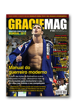
 Ours has been a plenty long road thus far, and we’ve had a number of emblematic covers ever since GRACIEMAG first hit the newsstands of Brazil, back in July of 1996. Could I be going cuckoo, for categorically making such an assertion?
I’ll explain. When our editor-in-chief, Raphael Nogueira, drummed up the idea of running a story on the role the hips play in Jiu-Jitsu, I signed without batting an eye. After all, as far as I know, there isn’t a body part that’s more vital in executing Jiu-Jitsu, nor one misused more often. This is because understanding the concepts comprising the role of the hips truly is hard to fathom.
But how do we go about illustrating such an important article?
At first, I was given fight scenes as a reference, but the images could serve just as well for covers on the hips as they could for ones on the guard or passing guard or flexibility. In other words, they were generic.
To the scrap heap they went. After giving it a hard think, we found the answer in the obvious. Alas, what better exemplifies hip use than the exercise likely performed by the vast majority of practitioners on their very first Jiu-Jitsu class—the hip shrimp?
When I put in a call to the super technical Caio Terra to figure out the best way to go about taking the picture, I began: “It’s the most basic Jiu-Jitsu exercise.” To which he promptly chimed in: “And the most important, right?”
Bingo.
The cover is a combination of the following characteristics:
- Originality. I at least haven’t yet scene such a position on the cover of a magazine so far.
- Focus. It illustrates precisely what’s featured in the article. That is, we nailed it.
- Identity. The move is pure Jiu-Jitsu. No other martial art or style of fighting could make use of the image.
- Simplicity. One character, no background, one position that every practitioner is familiar with. Steve Jobs would sign on to this idea.
- Execution. The photographer Terence Bordon executed the idea masterfully, and the quality of the artwork added by our editor Victor Gruzman was of like quality.
- Appropriacy. The character, Caio Terra, is notorious for the high level of technique he wields, and one of the main reasons for him being able to handle much heavier opponents is his excellent use of the hips.
I flipped through my collection of 185 issues as well as special editions, not to mention the newspapers we started printing back in 1994. Sincerely, I haven’t found a single other cover assembling all these characteristics. Hence the conclusion I drew.
What about you, agree or disagree? Please comment below.
The post The greatest cover in GRACIEMAG history first appeared on Graciemag.
